I quite enjoyed the graph in my winter training update post, and thought I would investigate this some more.
I’ve done 8 minute interval sessions four times this winter. Once again I held everything constant between the sessions. I wanted to see how my speed and heart rate changed in these sessions throughout the year. The tricky part with intervals is that heart rate takes a bit to stabilize. Moreover, in some intervals I would find a speed and hold it for the whole eight minutes. For other intervals I would hold a speed for a while, and then bump it up a bit throughout the intervals, perhaps several times! Thus it didn’t make sense for me to treat this one exactly like the Z2 graphs.
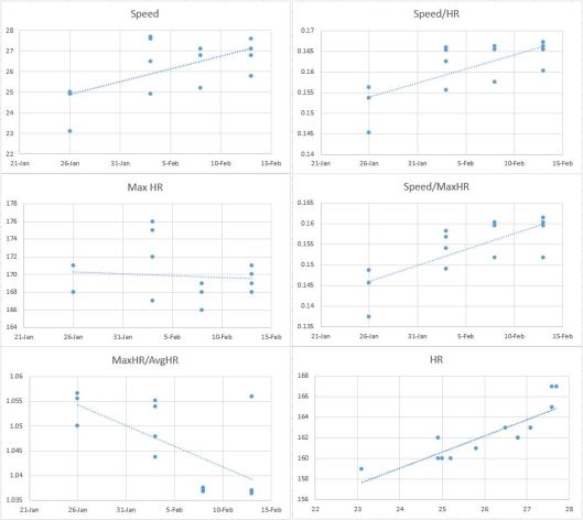
So instead what I did was simply look each eight minute interval from start to finish. I define the “start” and “finish” and when I raised and lowered my speeds. I am always careful to do so fairly quickly when I ride, so in my Strava files the “bumps” are very obvious. Then in each interval I recorded my average speed, average heart rate, and maximum heart rate. At this point I went a little crazy with my graphs. Here they are:
I think the titles are pretty self-explanatory. Since I did three or four intervals per session, there are three or four dots stacked up in each graph (except the last). The bottom-right graph shows my average speed on the x-axis, and my average heart rate on the y-axis.
So what can I conclude from these graphs? Let’s work top-left, then top-right, then second-row left, then second-row right, etc.
1) Over time the speed at which I have done the intervals has gone up. Note that my last three sessions were done only ten days apart, so we wouldn’t expect to see too much change.
2) Here I graphed the quotient avgSpeed/avgHR. Similar to my Z2 graphs in my previous post, this one shows that I’m going faster for the same amount of work.
3) Besides a very wonky second test, my max HR seems to be pretty steady.
4) Similar to graph 2, this shows that I’m getting more speed for the same max HR. Or conversely, at a fixed speed my max HR is lower, which is good.
5) This graph just shows that I’m getting better at performing these intervals. If the points all had a y-value of 1, that would mean that my maxHR = avgHR for every interval. Of course this is not possible, simply because my HR takes some time to stabilize. But since it is going down towards 1, we see that my HR must be fluctuating less.
6) Finally, we get a pretty strong linear correlation between speed and average HR. This graph does not take into account time. If we extrapolate a bit, we could estimate that to do an interval at an average speed of 29mph, I would expect an average heart rate near 167bpm. Obviously you can’t project this too far, since this relationship is almost certainly not linear globally, only locally.
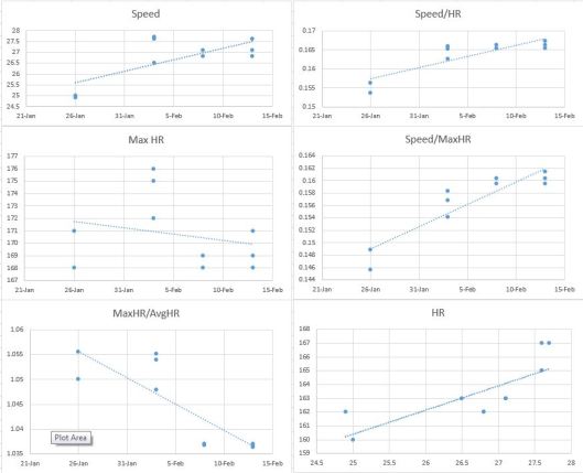
These graphs don’t necessarily tell me a whole lot about my performance, largely because there’s not enough samples. One problem is that my first interval is always slower than the others, and yet feels more difficult. Out of curiosity I went into the excel file and deleted each of the “first intervals.” This is what the graphs look like afterward:
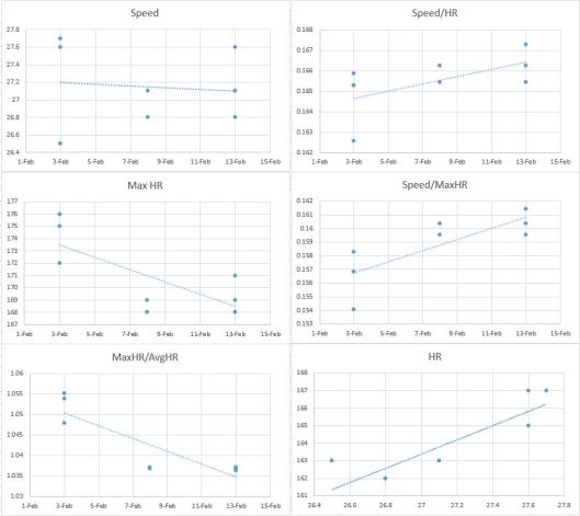
In general we see a much stronger linear relationship. Finally, I completely deleted the first interval session on Jan. 26th, since at that point I had no idea how hard I could push for eight minutes. Here is what they looked like:
As would be expected, it’s harder to draw good conclusions, just because there is so little data. The graph that is most telling is the “Speed/HR” graph, which shows that indeed, I am getting more efficient.
Anyway, that’s enough for now. I’m sure there will be more graphs to come!


